
Phd work in progress title: Architectural lettering and corporate identity / early branding on commercial buildings (1870s–1939): the Truman’s case.
An introduction to my research as PhD candidate: an exploration of the use of architectural lettering in early branding with a particular focus on public houses.


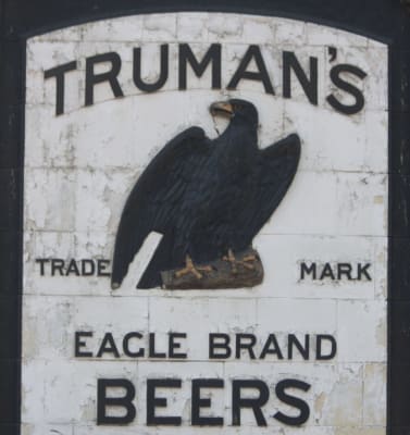
This research addresses the relationship between architectural lettering on commercial buildings and the emergent concept of corporate identity in the last years of the 19th century and first half of the 20th century (the 1880s–1939). It does so by concentrating on one case study, the British brewery Truman, Hanbury, Buxton & Co.
It argues that the flexibility of lettering in its ability to adapt to different contexts and particular needs was essential to the adaptability of corporate identity – ‘house style’ – during its formative stages, which allowed for a dialogue with its surroundings difficult to find today.
The main aims of the study are:
(i) to identify how the functions and uses, materials, techniques, and authorship, might inform our understanding of the relationship of architectural lettering to what we now refer to as ‘corporate identity’,
(ii) to record an undocumented aspect of the ‘graphic memory’ in the 20th century and to build a case for the protection of architectural lettering on commercial premises.
The objectives of the study are:
(i) to explore the purposes and functions of architectural lettering on commercial buildings with a focus on public houses,
(ii) to identify the materials, techniques, and approaches that were used and to what extent it is possible to understand the rationale for their use,
(iii) how the first two questions might also interrogate the usefulness of the terms ‘architectural’ and ‘fascia lettering’ in the context of public houses in the early twentieth century, and, more generally, how they will help us revisit definitions within the field of public lettering,
(iv) to identify the commissioning and authorship, and to investigate the roles of the makers,
(v) to identify early documentation on corporate identity formation and lettering in relation to current theories of brand identity, and finally
(vi) to develop methods for the organisation, comparative analysis and mapping of information on lettering in companies.
This research draws from Bartram (1975, p.7) and Smeijers (2013, p.14), who highlight the need for studying public lettering as a way to record and raise awareness of graphic visual history. By doing so, it is hoped that this study can also contribute to an increasing body of knowledge that can be used as a tool for graphic designers who can draw inspiration from the past, and as a way to avoid historical pastiches (Baines & Dixon, 2003, p.103; Laube & Widrig, 2016 p.11).
The development of the ‘house style’ was lead in England by the ‘great companies’, such as the railways, that expressed their individuality in their architecture and typography (Betjeman, 1972), and it is possible to detect a similar attitude across the United Kingdom and Ireland. Truman’s was a London brewery founded around 1666, which went through a significant expansion at the beginning of the 20th century. As part of the expansion, Truman’s acquired and contracted public houses around London and beyond, and by 1930 it had no less than 1300 pubs.
By analysing the archival photographs for the period 1910–40 held in the London Metropolitan Archive, I argue that it is possible to detect a ‘house style’ in Truman’s public houses; an identity based on a combination of architectural features and architectural lettering that parallels that of the ‘great companies’, and that has been systematically overlooked. In fact, Truman’s interest in a ‘house style’ was long-established, as proven by the fact that by the mid-19th century the cooperage in Brick Lane held ‘a painter’s shop for all the public house signs which the Brewery now supplied, and even an artist’s studio’ (Trumans The Brewers, 1966). This signals Truman’s as a landmark to explore architectural lettering during the formative years of corporate identity in the United Kingdom.
This study is qualitative in nature and is the result of a constructive, interpretative and reflective process. It is also a practice-based inquiry: a project that includes an artefact or event in addition or instead of the written thesis (Biggs, 2000). The main methods of inquiry are archival research, comparative visual analysis under the umbrella of design research. It brings together multiple methods from social research, marketing studies and graphic design, intending to generate new approaches within the field of architectural lettering.
The outcome will be a written dissertation and a digital exhibition. The exhibition, both a research method and a outcome, is an opportunity to develop an additional narrative to the written thesis, to explore elements such as scale and material, and to show visual elements in a way that the written thesis cannot (photographs, maps, timelines, objects) connecting patterns and finding relations.