
good news! less oil spills.
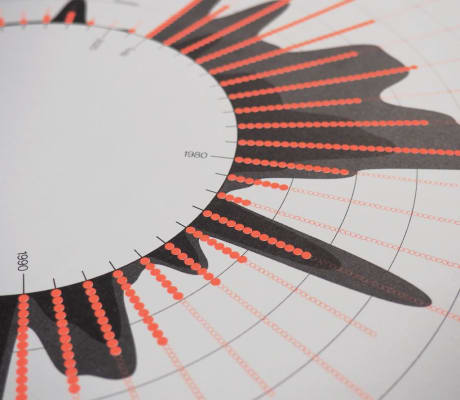
An information poster of oil spills in our oceans. And it is good news as there are less! My aim was to recreate an oil spill with the given data. By wrapping the line graphs around a circle which also functions as the timeline I was able to translate the numbers into something visual. The chosen colour for the graphs showing the frequency of oil spills each year is inspired by the vibrant orange/red paint of tanker ships.