
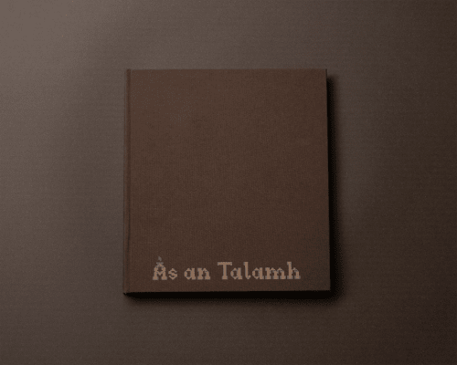
Às an Talamh
Às an Talamh (Ahs an Tal-iv), From the Ground, is the result of a conversation with The Flow Country. A representation of the landscape takes the form of a book, one that faithfully showcases it’s beauty and vast expanse through photography and writing, accompanied by a Gaelic (Gah-lick) translation. Bespoke typefaces informed by the peat-cutting process were designed; ‘Tusker’ (Toosh-ker), a single-serif typeface, and ‘Mòine’ (Moyn-yih), a display typeface. The book and typefaces aim to preserve the rich history in the same way that The Flow Country does.
Peat-cutting is integral in not just the history of The Flow Country, but Scotland as a whole, Ireland and even Iceland.
Figuring out a way to survive through the cutting, drying and burning of this decomposed plant matter is not only resourceful, but incredibly skilful.
Tusker (Too-sh-ker) is a single-serif typeface, designed for use in large bodies of text, reminiscent of the large body of peatland that spans The Flow Country.
Tusker is informed by one of three tools used to prepare and cut the peat, sharing the same name, Tusker.
This tool is used to specifically cut into the peat to create a singular ‘brick’ from the trench. The Tusker is a spade that features a flick, 90 degrees from the blade, when puncturing the ground it helps create the ‘brick’ shape.
Half-way up the shaft a piece of wood juts out, allowing you to push down with your foot to cut the peat.
Some more elegantly crafted Tuskers feature subtle flaring along the handle and shaft, presumably to help with weight distribution, or probably to show off their incredible craftsmanship, this flaring has also been embedded into the typeface.
'Mòine', laser-etched onto book cloth
Once cut, the peat would be thrown onto the bank, the formation of this would be a neat but consistent wobbly line, following the trench.
After the cutting was done, the peat would then be stacked to dry, into stòragan – a wigwam shape.
Due to the abundance of natural oils in the peat, the flurry of rain that pounds the Highlands would gently glide off of the stack, allowing it to dry properly.
Once dried, the peat would be collected and transported home, in some cases the peat stacks outside your house were humble, resembling a small ‘Jenga’-like tower, but for the most part this was proudly on display, stacked up like
a wall of defence.
Mòine (Moy-n-yih) is a display typeface, designed for only the most important text, reminiscent of the importance that peat has culturally and in survival.
The pride displayed in your peat stack residing outside your house is translated proudly into a decorative and intricate display of ‘brickwork’.
Leaning into Celtic roots, Mòine features more traditional stylistic-choices like the curved 3-pronged ‘E’ and ‘e’, notched cross-bars on the ‘A’ and ‘H’, and unusual Gaelic-informed ligatures – ‘ch’ ‘dh’, ‘ea’ and ‘Th’ – based on old handwriting found at a time when Gaelic was more prominent.
Trenches, The Flow Country
'Tusker', typeset with Gaelic translation
A reflection of the landscape